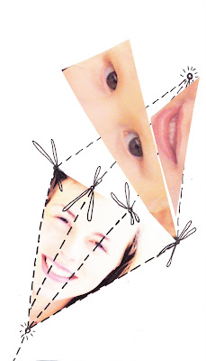
Waiting till we had a bright, sunny day these are the photo’s I took. I would like to use them in my illustrations to reflect the idea of nature, before it is improved and altered.

Waiting till we had a bright, sunny day these are the photo’s I took. I would like to use them in my illustrations to reflect the idea of nature, before it is improved and altered.


This is my final synopsis of study for the brief detailing my initial ideas, planned progression throughout the brief and the outcomes I will achieve and produce:
I will produce a campaign promoting that parents now have the right to design their own baby using Pre-implantation genetic diagnosis, more commonly know as the ‘Designer Baby’. Science already allows us to screen embryos for disease and remove those ‘infected genes’ produing a baby without an incurable disease. We can even deteremine the sex, although in most countris this is not legally allowed. This is just the beginning to what science will allow us to do in the forseeble future. I will be illustrating the possibilities of being able to design your own baby from hair and eye colour, right down to personality and traits. This will also be portraying future life where genetic enhancement is the normality, where a race of super humans will be built, a race of beauty and brains, in a Genetic Revolution. I will produce a ‘Its coming’ campaign consistiing of 6 illustrative posters which would be dispatched and displayed in towns and cities all over the world.
I have chosen this project because it will enable me to develop my style using a combination of photography and hand generated imagery. This approach to illustration is one that has seems to becoming an ever more larger trend, and one I want to determine myself a part of in my own unique way. By completing the D&AD brief based on ‘Resistance’ and the Lloyds TSB brief ‘The Art Of Nurture’ alongside the authorial brief I will linking my practice through a range oppourtunities. My direct target audience will be couple’s that are planning to concieve, however this is expanded to the rest of the public and the future generatons that the genetic revoluion: the creation of the perfect human will effect.


CREATE AN IMAGE FOR DON’T PANIC THAT CAPTURES THE THEME OF RESISTANCE
Creative Challenge:
Resistance is about going against the grain. Going left when everyone is going right. Resistance is radical for the short term, and revolutionary in the long.
We’d like you to capture on paper resistance to the politics (with a small ‘p’) of existence. From a personal level (interacting with you peers, neighbours and work colleagues) – to globally, countries, sexes & religions.
Consider sub-aspects of resistance – protection and armour (both physical and mental) aspects of survival, hardiness & determination. Try and think the opposite of your standard practice, work with new methods - push out of your comfort zone.
Target audience:
Socially active, creative young people
Mandatory Requirements:
Produce one or more images suitable for A2 reproduction


requirements
• we want a cool t-shirt – simple as that!
about us
• we think of ourselves as fun, creative and just a bit quirky
• the word wagamama means naughty/wilful child in japanese
• we can be a little tongue-in-cheek – as long as it’s funny and not offensive
• we are known for innovation and value originality
• we don’t like a cliché. our restaurants are inspired by the hustle and bustle of japanese noodle
bars, but our menu is an unmistakable blend of pan-asian fl avours. we think using asian
imagery might be a bit too obvious
what kind of design are we looking for?
• something that goes beyond a trend and is timeless – our staff might be wearing
this for years to come
• something you’d actually wear, a t-shirt you wouldn’t hide under your hoodie when you’re out
and about
• a t-shirt that allows for individuality – our staff are very diverse
• something that’s wearable and looks good on a bunch of different people and, of course,
looks good with black clothing!
• a design that has scope and can potentially evolve into a range of designs
• while it is a uniform, we don’t want people to feel as though they are wearing one – we always
say that we don’t want our staff to put a “wagamama face” on when they come to work. we
want our staff to feel as though they can be themselves!
branding
• if you use our star, make sure it’s the right way up, i.e. upside down
about our t-shirt
• cotton
• short sleeved
• relaxed fi t
mandatory requirements
• the only mandatory requirement is that the wagamama logo must be included
– but where (and how big it is) is up to you!
